Lost in Discovery Campaign
Client
Seattle Public Library
My role
Design Lead: Concept Development, Design, and Illustration
Software
Figma, Illustrator, Procreate, Photoshop
The Seattle Public Library approached me to design a visually engaging campaign to inspire young readers and foster enthusiasm for books. I was tasked with creating a compelling concept, designing the campaign logo, and developing both a landing page and physical book lockers to reinforce the message of exploration and adventure in reading.
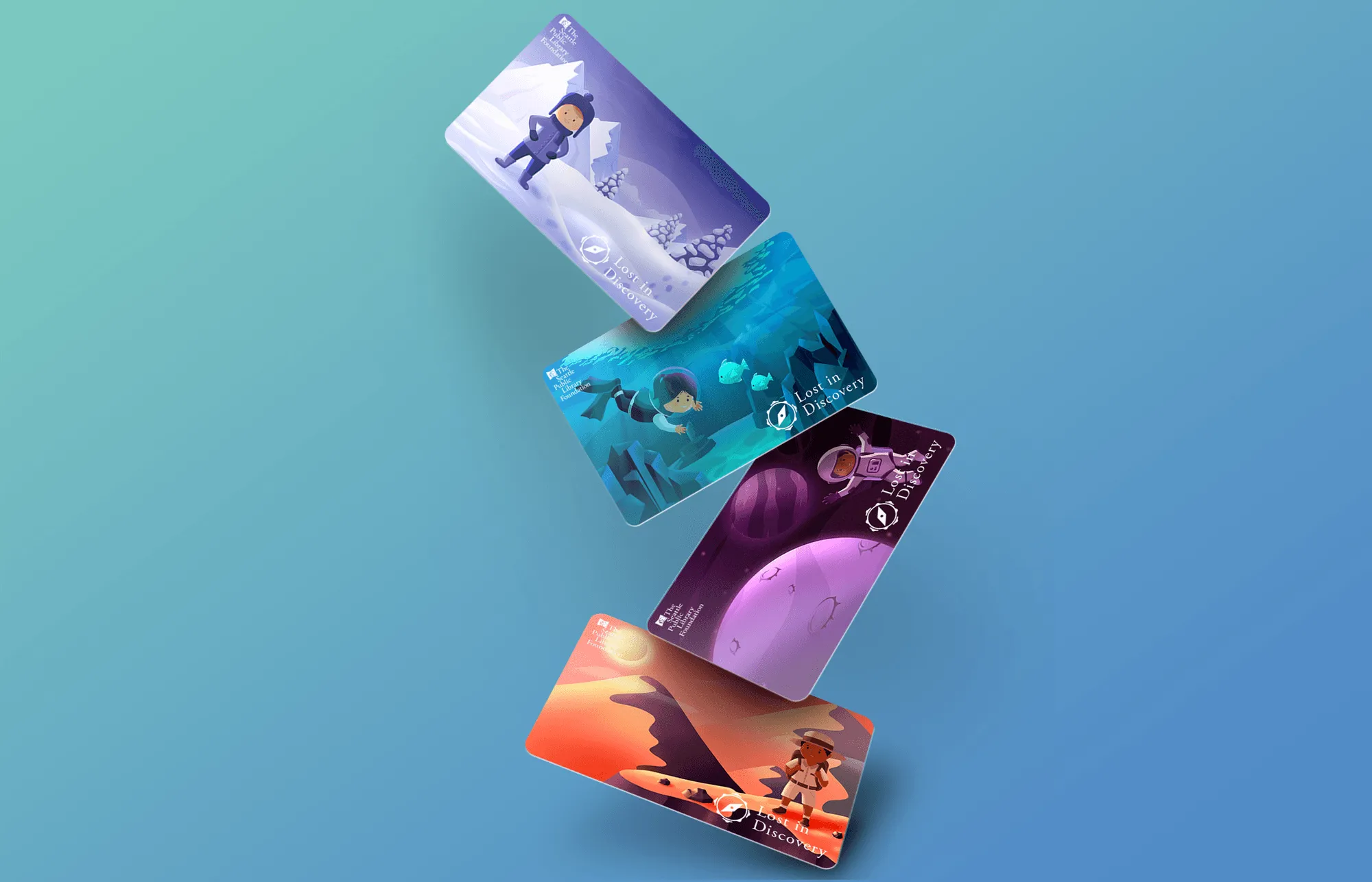
The campaign's concept centered on the theme of exploration, aiming to evoke a sense of adventure in young readers. I created a logo inspired by a compass, symbolizing the journey of discovery through books. To enhance this theme, I developed illustrated library cards featuring characters in imaginative environments, further reinforcing the excitement of reading. These illustrations were designed to be both engaging and aligned with the overarching theme of unlocking new worlds through books.
The logo was crafted to capture the essence of discovery, designed as a simple yet powerful compass-like symbol. The goal was to make it instantly recognizable and tied to the theme of guiding young readers on their journey of exploration. The logo also helped solidify the campaign's brand identity, setting the visual tone for the rest of the project.
I designed a user-friendly landing page with children and parents in mind. The page featured intuitive navigation, interactive elements like book recommendations, and a call-to-action encouraging engagement with the campaign. The layout and design were optimized for a seamless and enjoyable experience, ensuring children could easily navigate and explore the content.


Alongside the digital elements, I designed book lockers as a physical extension of the campaign. The lockers were aligned with the exploration theme and designed to engage young readers through playful, visually stimulating features. These lockers served as an interactive touchpoint, creating a unique and memorable experience for children while promoting the library’s resources.
I ensured all visual components, from the logo to the illustrations, were consistent across digital and physical touchpoints. This approach focused on scalability, allowing the design system to grow with the campaign and ensuring that all elements were adaptable for future use. Maintaining a cohesive visual language across all components helped establish a strong and recognizable brand identity for the campaign.


